Wednesday 11 December 2013

Q front page analysis

I am starting to get an understanding of the sort of codes and conventions which are used in a typical music magazine. Here is Q a popular music magazine with the age range varying from teens to middle aged this magazine has to include certain conventions so that they appeal to all audiences. The ideology of the magazine is to focus on gigs, upcoming artists and interviews from the famous stars which is where I will get a lot of inspiration from when making my finished magazine.

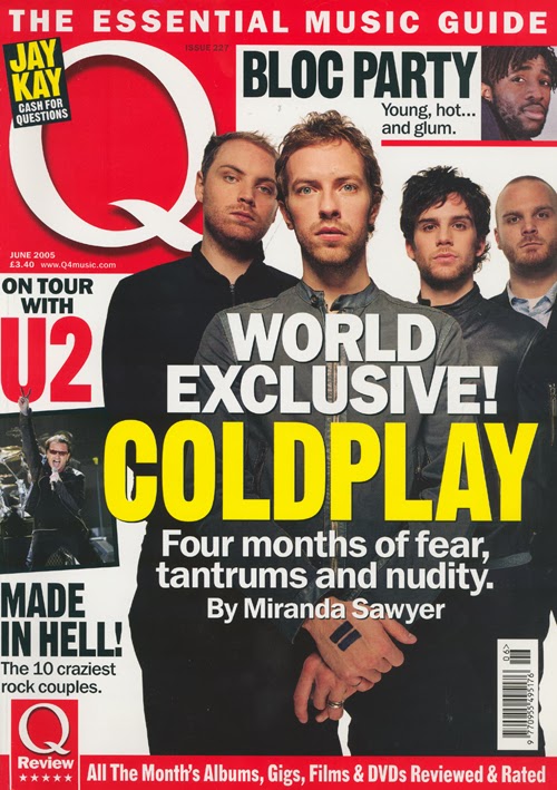
The magazine title is very captivating as it takes up a lot of the page with the masthead being white and a red box surrounding it, it is emphasised a lot on the page. This is done so that the audience can automatically know what magazine it is, the background colour of the magazine is plain so it highlights all of the headlines and the central image. The title is placed in a puff style so that it doesn't blend into the background. The central image is of the famous band Coldplay, all of the band members are making eye contact to entice the reader as it makes it more captive. The picture fills the majority of the page which shows that the main story in the magazine is going to be based on Coldplay.

There are also two smaller images which are spaced around the page each picture has a small headline next to it to give you the idea on what the story is going to be when included in the magazine. The other images included are not linked with the central image so it gives you the idea on the different stories which are included inside.

The colour scheme has mainly black and white writing although the masthead highlights the word ‘Coldplay’ in a yellow font this is to entice reader with the contrast of the colours so that it is easy to see if the magazine is on a shelf. The way Q has used the font is that any band which is mentioned they put in a larger font so that it headlines what artists are going to be spoken about in that issue. The different fonts used on the front cover makes the magazine look interesting, instead of it all in one font and looking boring.

The second title says 'the essential music guide' this has been cleverly placed as most people start looking at a magazine front cover from the top of the page. Seeing that the magazine is an essential music guide means it would intrigue a first time reader if they wanted to find a new interesting music magazine. This has been highlighted by a red box with white writing like the title, which emphasises that it's very important.

Saturday 7 December 2013

Font style mood boards

One thing that plays a big role in a magazine is the font style as it is what helps attract the reader into buying the magazine as the masthead is what intrigues the reader


Here are a few fonts which I like as they are bold and clear making it easy to read but also intriguing. The 1st font is my personal favourite as it has a fade effect of black which makes the font seems more interesting than the others as it has a contrast of two colours, it also seems very edgy which is something I wish to be portrayed in my magazine. I also like the font 'Bellerose' however I don't think that it would suit my chosen genre for my music magazine.

Friday 6 December 2013

Outfit mood boards

As I am thinking of having a number of models I wanted to make sure I focused on how I wanted them to dress so that they look appropriate for my magazine.

Below is a mood board of some outfit choices which I find appealing for my model to wear as they are simplistic and seem to fit the alternative genre of music which I want my magazine to be focused on. In the bottom right picture I like the simple make-up with the bright lipstick as it accentuates her features and it would appeal to my target audience of 17-18 year olds


I also made a mood board for male outfits as I would like to have a male model for my magazine as well. 


I really like the look of these outfits as they have a simple shirt with a jacket over the top, although the outfits aren't striking they look contemporary which would suit my music magazine. I like the idea of my models hair looking similar to the one in the top right as it is styled in the way that many people would aspire to look like


Thursday 5 December 2013

Music magazine front cover mood board


 I am going to make some mood boards depending on the different genre of music magazines


Here is a mood board of some magazine front covers from the rock, pop and rap genre, I like the idea of creating a magazine that's in these genre's as I like the masthead fonts as they are bold and intriguing to the reader. They make the magazine stand out as the colours used are strong which automatically makes the reader want to pick it up.


This is a country music mood board where you can see that a lot of the background colours used are dark browns or white. I have seen that the background colours are very different when looking at country magazines as they are a lot more calm and subtle, the font is also round which reflects that the music isn't as sharp as rock music.

NME contents page analysis


To get an understanding on the kind of contents page I wish to include I'm going to analyse a popular music magazine's contents page. First of all the masthead, the title of the magazine 'NME' is in red, this stand out from the rest of the magazine as most of the contents page is black and white. The font is bold and all the same size so that it stands out when you turn over from the front cover to the contents page. The use of the colours black, white and red initially gives you the understanding that the magazine is going to be focusing on the genre of rock.

The central image is in-keeping with the sub-heading which is great as it shows what the magazine is going to include. The contents page is split up with boxes to make is easier to understand what is inside, the headings are all bold so that you can easily find what you want when looking at the contents page. There is a puff in the bottom right hand corner it is in a red box which contrasts with the predominantly black and white page. It draws attention to one of the main stories which will be in the magazine where it is trying to promote different elements of the magazine.

There are different sized fonts on the page which varies the importance of the stories as the larger fonts seem to include the better stories. As Arctic Monkeys is one of the main stories the heading is a lot bigger which the magazine wants to emphasise. The contents page also includes promotional deals about subscription in a box of its own to make it seem important with some of the font being yellow it contrasts with the black, white and red colour scheme so that people automatically read it.

Wednesday 4 December 2013

Camera angles

I thought I would look at the different camera angles which I could use for my magazine, this had helped me get an idea on what angles I would like to use.


                                                                 Close up


                                                             Wide Shot


                                                       Over the shoulder shot

                                                
                                                      Aerial Shot


                                                          Low angle

                                                        Canted shot

Saturday 30 November 2013

Band Identity

Before I do any in depth planning for my music magazine, I need to create my bands identity. I only know the specific music genre which I am focusing my music magazine on. So now I need to base my research solely on the band.

I would like my band to be a duo, preferably one males and one female, who both fit the typical 'alternative' or 'indie' style. As I want my target audience to be 16-18 year olds I think its important that I make sure the models will wear fashionable clothing which a young audience can relate to and could feel inspired into wanting to look like someone from the band. There are two inspirations that I would like to base my band around, which is the Arctic Monkeys and Lorde.

Here is an image of Lorde, who fits the 'alternative genre' very well. I really like her bohemian hair which I think I would like to replicate when creating my band. I also like her natural, effortless makeup which could look great for when I start to take pictures on my photo-shoot.


Here are the Arctic Monkeys who I think also match the criteria of being in the 'alternative genre' I really like their rock and roll look with their leather and denim jackets which could work really well when I create my band. They are very a very inspirational band for teenagers aged 17-19 which is why I would like my band to have some of their persona.


These are the four band names which I have come up with, the highlighted name in the bottom right is the name which I am going to call my band. I really like the name 'the corrections' as it is quite mysterious. I think I could make a good logo for the band with this name as well which would look great on the front cover of my magazine. By having a young band with a name like 'the corrections' I personally feel that a young audience could be inspired as the name could be perceived as a hidden message of making the right choices.


Now for the bands logo, I would like my band to be seen as alternative artists but also be very mellow and relaxed. So I would like to make a symbol that would represent that. Below is a mood board of some symbols which inspires me to make my own for the band.

 
I really like the top left symbol of yin and yang, this could be effective to use for my magazine as I want my band to be seen as laid back. I also really like the simplistic logo to the right, it means eternity and is very simplistic which may work well with the band. I would like to put the bands logo next to the name so that people can associate the logo with it, I could also put it on the album cover which would help the band in the magazine. These logos fit in well with both the alternative genre as well as being very mellow.

Thursday 28 November 2013

Top of the pops magazine analysis

 Recently I have been analysing music magazines to get an idea of the different codes and conventions they use. Here is Top of the Pops magazine which is a music magazine designed for young girls who are interested in the genre of 'pop' music.


First of all it has a masthead, you can tell it's a pop magazine straight away as the masthead is in capitals with the colour being white it contrasts with the pink and white colour scheme. This has been chosen carefully to help intrigue young female readers. The layout on the magazine is quite chaotic due to there being a lot of puffs and boxes which includes information that is going to be in the magazine for example 'The X Factor Exposed' This helps to intrigue the reader as it gives them an idea of the stories that will be included in the magazine and it promotes certain elements.
 
The font used on the front cover is clear and bold which entices the reader, the different font sizes compliment the cover lines as they make the magazine seem more intriguing. The use of the different font colours tries to make the magazine seem fun and girly linking to the magazine music genre of 'pop.' There are a lot of secondary images used to help promote the stories these pictures are great for making young readers want to buy a magazine. This is a great tool to use when planning my music magazine. The central image used is of the famous pop star 'Taylor Swfit' this is the most important part of the front cover as it catches the readers eye before they look at the printed text. The eye contact is captured which is great as it reflects the message of pop music and femininity.  
 
There are several images on this page which is great for young audiences as the pictures are what draws them into reading the magazine more than the sub-headings. They show what is going to be included and gives you an idea on the types of artists that will be making an appearance in the magazine. The bar code and price is strategically placed as it is a straight forward feature of the magazine you don't want the main focus to be on it. The bar code is placed under the main headline which draws the attention away from it leaving the focus all on the headline and the main image.


Plan

Now I have completed my school magazine I can work on my task which is creating a music magazine front cover, contents page and double page spread. Here is a plan of the set time I have given myself to complete certain tasks to ensure I get everything completed.


Friday 22 November 2013

Finished magazine front cover and contents page

After receiving some feedback from my peers regarding my school magazine they gave me a few pointers to help improve my magazine it was useful so that I could change the layout and structure of my magazine.

For my front cover I was told to make my masthead bigger and change the font colour as it seemed to blend in with the background of my magazine. After making these changes I have found that 'Idsall Weekly' looks a lot more prominent, I also enlarged the size of my logo so that it was clearer on the page and was emphasised a lot more. This will hopefully engage the reader into wanting to understand what the magazine would include.

When receiving more feedback I was told to move the puff further down the page so that everyone's faces in my background picture could be seen so that the eye contact from the models to the reader wasn't ruined in any way.


My contents page is where I made the most change one of the main things I amended was the amount of pictures I used. Previously I said that I wanted to include as many pictures as possible to give the reader an insight into the school, although I have now come to the decision that they looked to close together. So instead I used two large pictures which now makes the presentation of the contents page look a lot more proffesional. I also added a box behind the contents page so that it made the masthead stand out, this has made the page look more professional. I enlarged the logo in the top left corner so that we still understood that it was a school magazine, I am happy with the changes I have made to my contents page as it looks less crowded and more focus is on the stories.


Thursday 14 November 2013

Draft magazine front cover and contents page

For my preliminary task I had to create a front cover and contents page of a school magazine. After researching some past school magazines I had an idea on how I wanted to lay mine out and what colours and font style I wanted to use.

 Here you can see the front cover of my school magazine this is the draft so I will be making amendments to it. I decided to use the background picture of a group of students as it gives a more personal feel to the school, also I decided to use the picture of a tree as my logo so that it makes it still significant to Idsall school. I used a puff on my front cover to show what stories are going to be inside the newspaper this gives the reader an idea on what to expect when they start to read the newspaper which makes it more intriguing to read. They emphasise the main stories in the magazine so then the reader is interested on what it has to say.

The colours I have used are all green to link with the school uniform making the magazine tie in with the main colours that the school wears. This is great for students and parents when reading a magazine as it shows that the colour scheme has been thought through. I also included the school logo in the top left corner to make it seem more proffesional as it makes the magazine seem legitimate and that its focus is on Idsall school.


Here is my draft contents page, I decided to carry on with the colur scheme so it is all green and white. I wanted to include as many pictures as possible so that you could get an idea of what the school was like and how it differed from others. I carried on with using the logo so that it still seems professional and links back to the Idsall School, the news headlines only give the titles so that not much is given away still making it intriguing for the reader. After looking at the magazine I have found a few things which I would like to change for example the stories, the font size and the amount of images. I feel that the images are too overcrowding which takes the emphasis off of the stories which would be included in the magazine.


Tuesday 15 October 2013

Editing Picture's

Before creating my magazine I needed to develop my knowledge on how to use Adobe Photoshop so I could edit pictures for my school magazine. Below is one of my first attempts of editing a picture.


Here is a picture of Alex turner from the Arctic Monkeys, this is the un-edited picture of him performing.


I then edited the picture with Adobe Photoshop, from the picture below you can see that
I made the image sharper and enhanced the vibrance which emphasised the clouds behind Alex. By changing the exposure of the picture I managed to make his face clearer and it made the image seem more powerful and would capture the audience.


Wednesday 25 September 2013

School magazine mood board

here is a mood board which I created on Prezi, to plan the production of my magazine

Tuesday 24 September 2013

Codes and conventions in a school magazine

Analysis of a school magazine:      


I wanted to analyse a previous Idsall Voice which is a termly magazine which shows the events that have been taking place around the school. I used this to get some ideas on how I would like to set out my magazine.

 One of the first things that is very striking is the masthead. The font is bold which presents to the audience formality and structure which I have found school magazines have to have so they remain professional. The colour scheme also links in well with the school uniform colours which keeps the article on topic and relevant to the school and it makes the reader understand what the article is going to be based on.

The front cover of the product is full of text which is unwelcoming to the reader especially as our main target market is the students. I had the idea that for my front cover I would like to use minimal text and use 'puff' to intrigue the reader into wanting to know more about the article. The short headlines will give the reader enough insight into what the magazine will contain without it being overwhelming.

For my magazine I would like to include pictures which show the school environment and the students which make up the school, this gives the magazine a more personal feel as the Idsall voice only includes a picture of the headmaster on the page. This gives the impression that it is a more formal text which is what I want to avoid when making my front cover.


Wednesday 18 September 2013

Codes and Conventions


Codes and Conventions


I went and researched the different codes and conventions which are used in school magazines, to help the audience become drawn into what they are reading. All magazines have a large demographic but every code and convention used in a magazine are very similar.

One of the codes and conventions I found out about is a masthead, when producing my magazine I will need to ensure that I include the magazine title in the largest and boldest font which will be the full width of the page. This means that the reader is likely to be interested in what they are about to read. During my research it became clear to me that the magazine needs a colour scheme so that the front cover looks structured and well presented. The colours need to fit in well with the magazine, they need to be bold to attract the reader but not to over-powering that it looks unprofessional.

On the front cover of my school magazine there needs to be a lure which is seen as a marketing device this could be a simple word or sentence that would make the reader feel more inclined to read the articles which would be in the magazine. There is always a contents page which is included on the first page of the magazine. This is used to help guide the readers on the different articles that are included and tells you what page they are all on.

Another code and convention used is a tag, they are words used to catch the eye of the reader for example 'Exclusive' Which automatically draws the reader in.


Here is a magazine cover from Vogue a world famous fashion magazine. This magazine uses different codes and conventions to present a product which entices the reader to look further than the front cover. One typical code and convention which has been used is the large masthead which is the full width of the page. This has been done so that when potential readers look at the front cover they will automatically be able to understand what the magazine is about just from the title.

You can also see that the magazine has exclusive articles as the font has been put in different colours and sizes to emphasize the main articles which the magazine entails. The different sized font intrigues the reader and stops the magazine from becoming bland. The camera angle is in a mid-shot this makes the model stand out and creates brilliant eye contact too draw the reader in.  

In the magazine you can see that the language used is simple so that all age groups can understand what is being presented in the news article. This makes it easy to follow and relatable to all ages. The different font sizes also highlights the most important articles which you would rather read. The different coloured font used on the front cover draws your attention because the colours are contrasting with each other making the articles stand out more. This is a great technique too draw in the reader which I'm tempted to use.


Tuesday 17 September 2013

Hello my name is Emily Harris and im studying AS Media Studies at Idsall Sixth Form, this is my blog which will contain many items from the media. Each piece of my work will be posted on this blog