Friday 31 January 2014

Final decision on names for music magazine

I have sent out a survey to 5 people to find out which name they prefer for my magazine. I have made sure that they are in the age range of 17-18 year olds so that I can get feedback from my target audience. I have also made sure that I have given people background information on my magazine and the type of genre I would like to make it.


Here are the results on people's preferred magazine name:


As you can see from these results both 'Buzz' and 'Gracioso' have only received 20% of the votes whereas 'Amplify' is the most popular with 60%  Overall I think that I prefer the name 'Amplify' as it is related to music, the word amplify is used to make music loud. This represents my magazine as I want it to be big and loud so that people are attracted to it. I feel that this name will attract both a male and female audience so the magazine can suit anyone.

Wednesday 15 January 2014

Photoshoot

Here are a few pictures of my first photoshoot where I got three of my friends Laura Cooke, Tyler Felton and Mitchell Fassett to model for me. I chose the location of a wood so it gave an alternative feel.


I feel that I should have used the flash on my camera when taking this picture as it is very dark which may not look professional on my magazine


 I like this image however I feel that the lighting lets the shot down

 
Here are a few others in a second location with my cover model Laura, I got her to change her outfits so that it would make the pictures in the magazine look more interesting


I have decided that Laura will be my main model who will feature as the central image on my front cover. I will then decide which other model will be used for my band which I will create.

Wednesday 8 January 2014

Analysis of a double page spread

Now I have done some market research I need to see what is included in a double page spread so that I can get an overall idea on what I would like to include.

 Here is a double page spread which has a very specific colour scheme of black, white and red. The background is all black which contrasts really well with the white and red colour scheme which alternates throughout. The headline font is very bold and co-ordinates all of the colours correctly already giving the reader the impression that it's to do with a rock genre.The headline is also a quote used from the interview which encourages the reader to read the whole article so that they can find out how the band is being the best that they can be.


The model used in the central image is not making eye contact which distances the reader and the model, for some people they would be put off by this. But for others they will find it intriguing and want to read more as the pictures don't give anything away. The central image is black and white giving a rock and roll effect, the use of other secondary images shows the band whilst recording some music which is great as it shows the band in different locations whilst they are working.

The majority of the text on the double page spread is white which contrasts witht the headline and the puffs which are used to give an idea on what else the magazine has to offer. As in the top left hand corner there is a puff which highlights that news can be found on the magzines website. This is a great device used on the double page spread as it allows the readers to get more for their money as they can look at more news on the website.

Content of my magazine


I wanted to find out what people would like to see included in my music magazine so they are satisfied with the magazine. I asked a different group of people that were in my specific target audience so that I got a new range of people to tell me there opinions.


Here are a few replies that I got from people:

 
Here you can see that this person would like things included in the magazine where she can interact such as quizzes and competitions. Asking someone else to tell me what they would like to see included in the magazine has been beneficial as I never thought about including up-coming events. Which music lovers would be very interested in as they would want to go to the biggest and best events in the music calender.
 
 
This is a few more replies from my peers who gave their opinion on what they would like to see in my music magazine


After collecting this research I think that there is a common theme where people want to have interviews included. Other ideas that were suggested which I like are quizzes and free music downloads as they would intrigue the reader to getting more for there money.

Tuesday 7 January 2014

Questionnaire Analysis

Now I need to analyse my results from my questionnaire to get an understanding of peoples opinions, so I can alter my magazine to suit their personal interests and what they would like to see in a music magazine.

Here is one of the results that I received, I asked the question how old people were so I could see who had filled the questionnaire out. I thought I would make a chart to make it easier for myself when analysing my results. From the chart you can see that around 60% of the people that filled out my questionnaire were 16-17 year old's. Then around 20% of people were 18-19 years old, after looking through the questionnaires people had answered 90% of people are in higher education which is the age range which I would like to focus my magazine around.


I then looked at the gender of the people who had filled out my questionnaire.

 
Out of the 11 people that filled out the questionnaire 45% were male and 55% were female. I wanted to ask both genders so I could get two perspectives on what should be included in my magazine. As I am unsure on whether I want to make the magazine gender specific or appropriate for everyone.


Here I asked my audience what their favourite music genre was as I wanted to do some market research in to people's preferred music genre. You can see that pop is the most popular genre with it being around 30% it is then closely followed by rock and R&B at 25%
 
I think that I will do some more research into these genres as it is clear that my target audience prefers those types of music. Although country music got 20% of the vote I think I would like to create a magazine that a lot of people would be interested in, as country music is a very niche market.


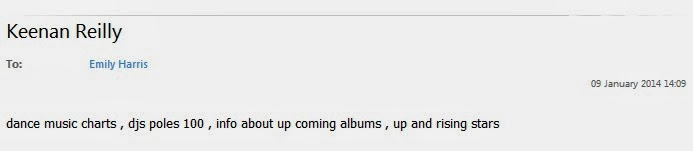
I then wanted to find out whether my target audience of people between the ages of 16-19 year old's buy music magazines on a regular basis
 
Here you can see that 80% of people don't purchase music magazines which is very interesting as I now know that to make my magazine exciting and intriguing so that people will want to read it. This is a significant number of people who don't purchase music magazines so I will need to do some further research in to what people would like to see included in my magazine.


Finally I needed to get an idea on how much I would price my magazine at, below you can see the graph. Although once I had got people to complete my questionnaire I realised that I had overlapped the numbers which meant that the pricing of the magazines didn't seem reliable
 
 
The graph shows that over half of the people that answered the questionnaire would pay £2-£3 this seems to be a reasonable price to pay for the content of the magazine.With 20% of people happy to pay £4 or more I think that people will pay for a magazine that includes things that they like. So I now need to do some research into what people would like to find in a music magazine as I didnt ask this in my questionnaire.


Thursday 2 January 2014

Questionnaire

I made a questionnaire to find out what people like to find in music magazines, I focused mainly on a target audience of 17-18 year olds. I asked 11 people to fill out my questionnaire via Facebook as I used an online questionnaire so it was quick and easy to collect the results.


Here is my online survey which you can view here:  https://www.surveymonkey.com/s/6HKNWZR
 
 
This is one of the questionnaires that have been filled out, you can see that I have asked 7 questions as I wanted the questionnaire to be concise but have all the relative information which will help me get an understanding on the direction I would like my magazine to go.

Q Contents Page Analysis

This is the contents page of the music magazine 'Q' the central image is of Adele which gives the reader a clear understanding that she is going to be one of the main stories in the magazine. The colour scheme is red, black and white which is bold but doesn't distract you from what is being focused on in the magazine.

Along the left hand side of the contents page there are a lot of cover lines which features what is going to be included. The mode of address is quite informal so we get an understanding that Q want their readers to feel  relaxed and on the same level as the artists.

The fonts vary when looking at the contents page where the title's are much bolder and larger this gives a great effect as it makes it clear to the reader the different things that are going to be focused on during the issue. There is a secondary image used which promotes the different articles which will be in the magazine. It gives a variety between the text and the pictures making it appealing for people who prefer to get an idea of what the article is about through a story. Both images on the front cover are using eye contact as a way to entice the reader into reading the magazine.

In the top of the page the magazine logo is used just to reinforce to the reader what the magazine is called so that they will be persuaded to purchase it again in the future.